Bonus points to whoever can decipher this chart:
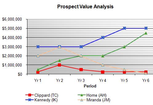
No? Well, it has something to do with a bunch of baseball players whose initials don’t match their names. There’s also some “periods” (which are called “Yr”). We don’t need no stinkin’ Y-axis, because it’s clear that periods are plotted against… uh, “money?” It also looks like someone needed a title, shook a magic 8-ball, and “Prospect Value Analysis” floated into the transparent window.
I’d go on, but the real fun is in reading the comments.
Via the incomparable FJM.


0 Responses to “Graph ungoodness”