If you're new here, you may want to subscribe to my RSS feed. Thanks for visiting!
Enough random posts…
 “How hard is it to break with our clicking habits? What happens if we remove the essential element of navigation from an interface which we are accustomed to? Does it change our behaviour of navigation? Is this change for good or for bad? What do we gain from it? Do we miss The Click at all? Does this have any influence on our perception of the interface? Is clicking really rooted that deeply in us, that we cannot resist it?…”
Interesting experiment - a web site with an entirely click-free interface.
Link
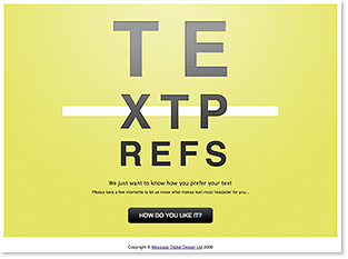
Message Web Design has created a unique way to survey users’ online text preferences.
We have created an easy-to-use web application which allows users to adjust an on-screen display until they find the text to be easiest to read. They can adjust the font, size, line height and column width - the major contributing factors in legibility.
Once they’re happy with the display they can submit their text preferences to our database, where they will start to build up a large and detailed statistical picture.
Interesting. Very novel. I’m sure the results will… uh-oh:
Many designers have their own ideas about what constitutes ‘readable’ text, but much of this wisdom seems to be based on tried-and-tested rules from the world of print. While researching articles on the subject they often seemed to restate concepts I first heard twenty years ago!
We want to put some hard facts into the subject, rather than rely on anecdotal evidence and received wisdom from the book publishing world….Our goal is to create a report enabling us to state, from a position of knowledge, some hard facts about what constitutes ‘readable’ text on the web.
So, Message gets +1 for creativity, but -1 for faulty assumptions and expectations.
First, for the record, research on online text readability does in fact go back to the print era, but there is plenty of modern research on it as well.
But more important is the (apparent) flawed assumption that a user survey alone will provide the best, or even valid, picture of what constitutes readable text on the web. Readable text is a very loaded phrase that is inclusive of very many things, among them:
Text color and background - Related to legibility. Research has shown that black on slightly off-white offers faster reading speed than black on pure white, for instance.
Audience age - Different ages prefer different font faces/styles/sizes.
Audience environment - This is a big one. What percentage of users taking this survey are using 15″ LCD screens with ClearType enabled? How can one scientifically group such a user with another who took the test using a 19″ CRT?
Content - Users prefer different line length/font size depending on how technical or casual the content is.
None of these issues, central to the core of what defines readable, are gathered in this survey (at least for me; at this writing I was never asked to provide any information about myself or my viewing environment before or after submitting my preferences.)
I wonder how Message will use their results. Surely, they’ll be able to define a bell-curve like range for their parameters, but even that can be a dangerous thing to apply as a generality when designing websites. If the company were to use the results of this survey, with most participants linking in from blogs, emails, etc., to design a site for a very narrowly defined audience, well… it’s easy to see where things could go wrong.
The main thing missing is a metric of how one defines readable - to me, the concept of a user’s preference is too unscientific and vague. To make matters messier, users are notorious for not understanding what the difference is between preferred and best.
Consider the following overly-simplistic example: If shown pictures of a group of cars, and asked to rate the one I prefer, I’d probably choose a Lamborghini. But if my metric for choosing was gas mileage and insurance premiums, I’d probably go with the Prius.
Same with usability. When you try to determine what constitutes readable, you must first define your metric. Is speed the main goal? How about information retention? The two can be mutually exclusive. Designers would use tradeoffs to prioritize questions such as these, and therefore by definition, “readable text” can be a fluid concept for different audiences.
Having said all that, head on over to Text Prefs and give it a shot anyway. We’ll have to be careful to not over-generalize the results, but the information should be interesting nonetheless.
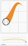 Lokesh Dhakar has illustrated a series of diagrams showing the trajectories of variously-pitched baseballs.
The illustrations are simple and clean, and yet still communicate a large amount of information - movement in three dimensions, ball orientation at pitch point, and speed. (Note the color gradients from yellow to red to indicate different speeds.)
Check it out.
As an avid hiker and a technical communicator, I was totally geeked by this awesome interactive piece by the New York Times on climbing Mt. Kilimanjaro.
Combining a well-written storyline with a great technical presentation, the piece covers Tom Bissell’s experience as he summited the lofty African peak. Using a Google Earth-based 3-D timeline, each stop along the journey shows Bissell’s heart rate and blood oxygenation, along with a brief video diary entry.

This is a textbook example of the appropriate way to use technology to enhance communication. It would have been very easy to get carried away with Flash here, and have tons of unnecessary bells and whistles. However, the first-person narrative is the most important feature of the piece, and the multimedia-based information is kept peripherally tasteful - only used to keep the audience centered and engaged in the storyline.
Link
Via Modern Hiker
Bonus points to whoever can decipher this chart:
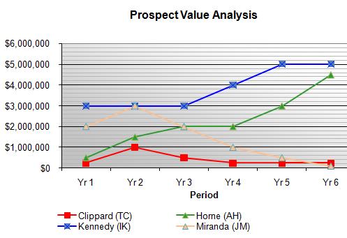
No? Well, it has something to do with a bunch of baseball players whose initials don’t match their names. There’s also some “periods” (which are called “Yr”). We don’t need no stinkin’ Y-axis, because it’s clear that periods are plotted against… uh, “money?” It also looks like someone needed a title, shook a magic 8-ball, and “Prospect Value Analysis” floated into the transparent window.
I’d go on, but the real fun is in reading the comments.
Via the incomparable FJM.