As an avid hiker and a technical communicator, I was totally geeked by this awesome interactive piece by the New York Times on climbing Mt. Kilimanjaro.
Combining a well-written storyline with a great technical presentation, the piece covers Tom Bissell’s experience as he summited the lofty African peak. Using a Google Earth-based 3-D timeline, each stop along the journey shows Bissell’s heart rate and blood oxygenation, along with a brief video diary entry.
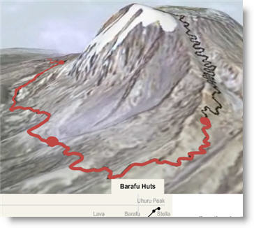
This is a textbook example of the appropriate way to use technology to enhance communication. It would have been very easy to get carried away with Flash here, and have tons of unnecessary bells and whistles. However, the first-person narrative is the most important feature of the piece, and the multimedia-based information is kept peripherally tasteful - only used to keep the audience centered and engaged in the storyline.
Link
Via Modern Hiker
 Lokesh Dhakar has illustrated a series of diagrams showing the trajectories of variously-pitched baseballs.